AI Assisted Design System: Designer's Journey into Code
How I built a production-ready design system from Figma to npm packages using AI-assisted development tools.
OVERVIEW
About the project
This project covers the creation of a scalable design system built from scratch. It began in Figma and evolved into a production-ready set of React components, design tokens, and documentation using AI-assisted development tools. Midway through the process, the system was formalized and named Beacon, reflecting its role as a foundation for consistent UI across products.
Beacon is published as reusable npm packages (beacon-ui and beacon-icons) and is designed to scale as new components are added. This case study focuses on turning design decisions into working code. The website you’re viewing is built using the system itself, showing it in real production use.
BACKGROUND
Why build it
As a UI/UX designer with a Computer Science & Engineering degree, I understood code conceptually, but hands-on development was always a barrier. The emergence of AI coding assistants like Cursor, Claude Code, and MCP (Model Context Protocol) presented an opportunity to push beyond traditional design deliverables and actually ship working code.
The goal was ambitious: build a complete design system that could be used in production. This meant creating real React components, establishing a token pipeline from Figma to code, building a documentation site, and packaging everything for distribution via npm.
The Process
Tokens & components
Single source of truth
Design-first structure
Tokens exported as JSON
JSON → CSS / TS
Figma MCP → Cursor
Versioned npm libraries
Independent updates
Safe system adoption
Component previews
Live playground
Usage-first docs
npm used in projects
Docs guide usage
System scales in prod
Design Source
Foundation
The design system begins in Figma, where tokens and components are defined together using an atomic design approach. Core design values such as color, typography, and spacing are abstracted for reuse, while components are composed from these shared foundations. This keeps visual decisions and component structure aligned early, embedding system thinking directly into the design phase rather than retrofitting it during implementation.
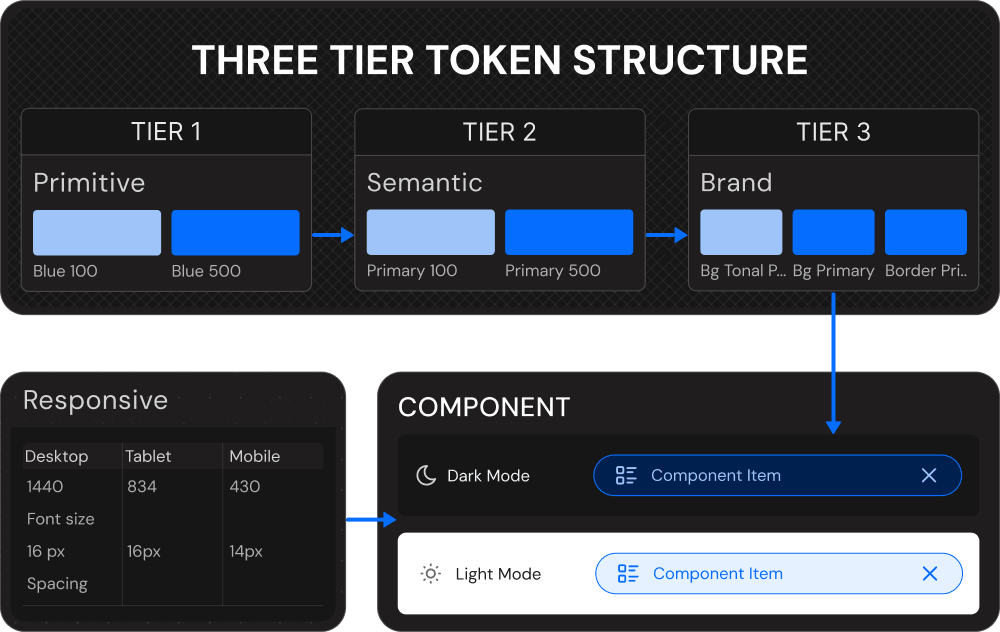
Core design values such as color, spacing, typography, and radii are abstracted into a structured token system. The tokens follow a three-tier approach that separates raw values from intent and branding:
- Primitive: Raw design values that store the base data
- Semantic: Tokens that express meaning and usage context
- Brand: Tokens that map the system to a specific visual identity
In addition to these, a dedicated responsive token collection is maintained to manage device-specific values. This layer defines breakpoints for desktop, tablet, and mobile with default widths of 1440, 834, and 430, ensuring layout and spacing scale consistently across screen sizes.
This structure allows design decisions to evolve independently while supporting theming, responsiveness, and long-term scalability. The complete Figma file is publicly available in the Figma Community under a Creative Commons 4.0 license, allowing anyone to view, use, modify, and adapt the system without restrictions.
Design to Code
Automation
Token Automation
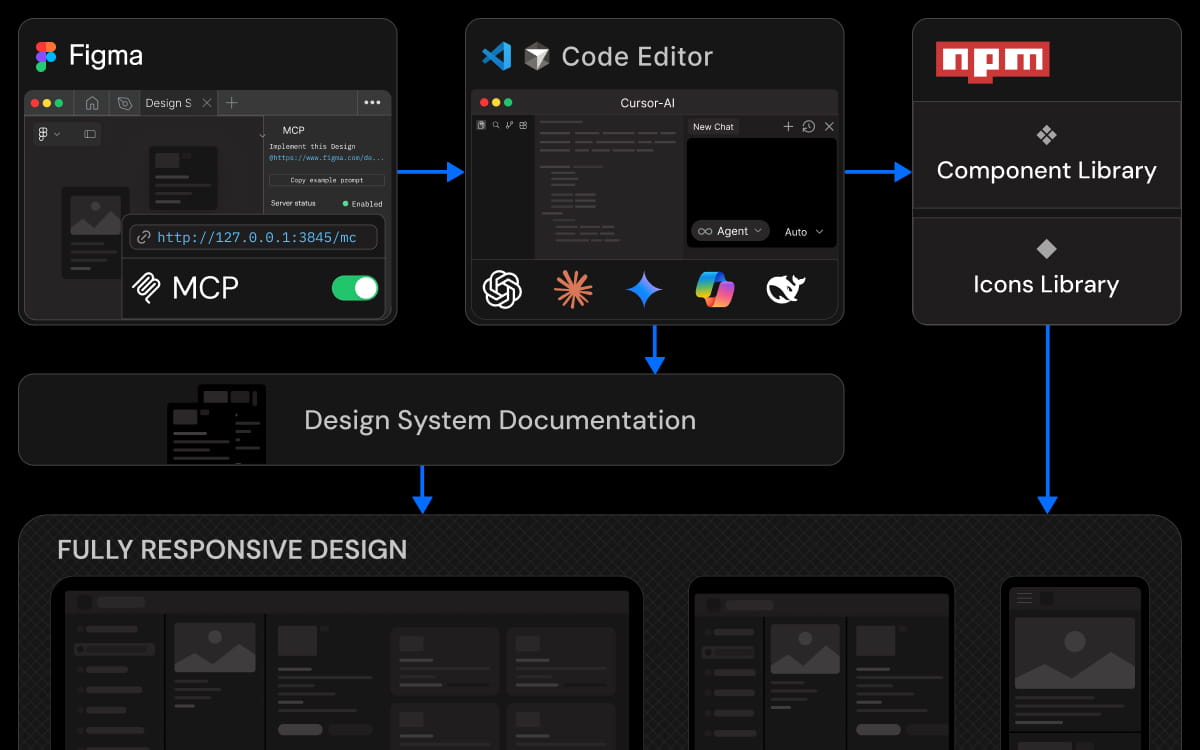
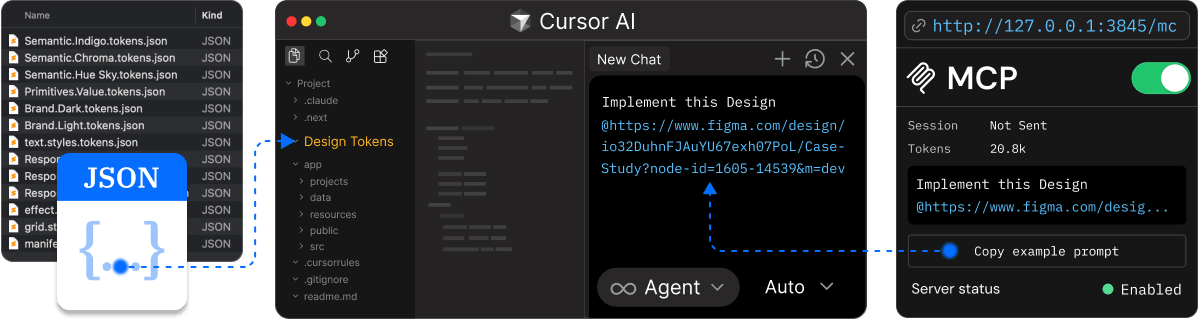
'The transition from design to code is handled through an automated token pipeline. Tokens defined in Figma are exported as structured JSON, preserving hierarchy and relationships instead of flattening values into isolated styles. This ensures that the system logic established during design remains intact when it moves into implementation.'
'The exported JSON is processed through automated build steps that generate CSS variables and TypeScript types as part of the project setup. Tokens become directly usable in code with type safety and without manual duplication. By exploring the project repository, you can see how this automation is wired into the system and apply a similar approach within your own setup.'
Design Context
'Design context is integrated into development through Figma MCP, which connects Figma directly to Cursor or any AI-native code editor that supports MCP. Component structure, layout intent, and design references are accessible inside the editor while implementation is in progress, keeping context close to where code is written.'
'This removes the need to interpret designs from screenshots or written explanations. Implementation is guided by real design data at the point of execution, reducing handoff friction and minimizing interpretation errors. If you want to explore this workflow further, the Figma MCP documentation provides guidance on setup and integration.'
Distribution
Packaging
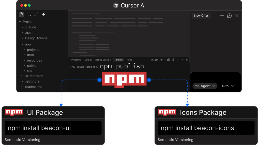
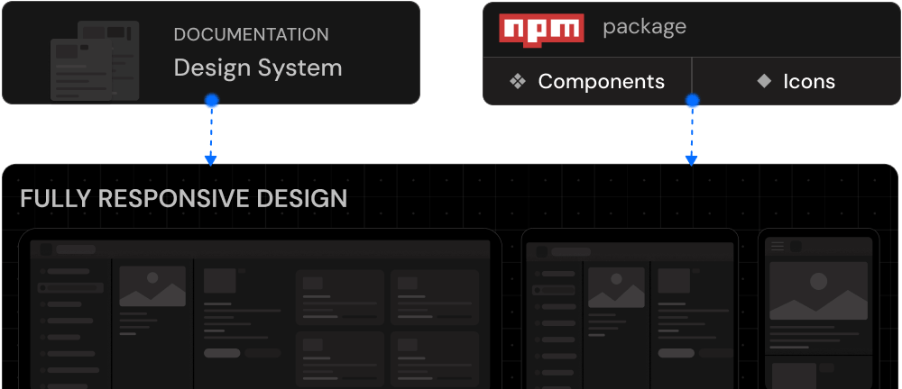
The system is packaged for reuse and published as versioned npm libraries: beacon-ui for core components and tokens, and beacon-icons for icons. Splitting the libraries gives you the flexibility to use your own icon solution if needed, while keeping the core UI package focused and independent.
This separation also gives you a more controlled upgrade path. The build pipeline manages bundling, exports, and type generation automatically, and semantic versioning keeps updates predictable and safe. The design system is delivered as a distributable product rather than an internal artifact, making it easy for you to adopt across multiple codebases.
System Guide
Documentation
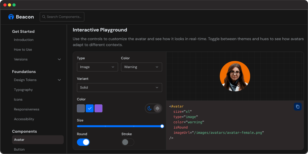
Documentation is built alongside the system and treated as a core deliverable. Each component has a dedicated page that explains its purpose, supported props, and recommended usage, with visual previews that reflect real-world scenarios.
An interactive playground allows you to experiment with variants, states, and themes before integrating components into your project. Because the documentation is generated from the same source as the components, it stays aligned as the system evolves. This turns the docs into a practical guide rather than static reference material, helping you adopt the system with confidence.
Product Build
Consumption
The system is consumed by installing the published npm libraries directly into your project. Components and tokens are used in production code to maintain visual and behavioral consistency across applications.
Documentation acts as the reference for correct usage and patterns, helping you move quickly without breaking system constraints. Updates are introduced through versioned releases, allowing improvements to be adopted safely as products evolve while keeping the system maintainable over time.
SETUP
AI-Assisted Development
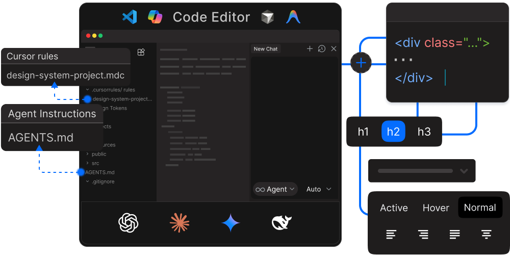
AI code editors like Cursor, Antigravity,Claude Code, and GitHub Copilot work better when they understand your project. Two key files help them:
- AGENTS.md - Contains workflows, step-by-step guides, and quality standards that AI assistants reference when writing code.
- .cursor/rules - Sets coding standards and patterns to keep everything consistent.
AI-native editors integrated with Figma MCP understand design tokens, file structure, and documentation context upfront. This allows Figma components to translate directly into aligned code, shifting design system work from repetitive implementation to collaboration focused on design decisions.
Outcome
Beacon is available on npm as beacon-ui (components and tokens) and beacon-icons (icon components). It includes production-ready components, a complete design token architecture, and TypeScript support. The system continues to evolve with new components and improvements being added regularly.
Documentation is published at beacon.uxraza.com with live examples, prop docs, and theming demos. This portfolio website serves as a real-world example of Beacon in use, demonstrating that the system works for production applications.
Conclusion
Beacon demonstrates what is possible when designers leverage AI-assisted development tools. By combining design expertise with Cursor's coding capabilities and Figma MCP integration, a single designer can build a production-ready design system that supports real products.
The barrier between design and code is becoming more permeable. With the right workflow, designers can extend impact beyond static files and ship reusable systems with consistent tokens, components, and docs.