Hive Work UX Case study
Adapting a Desktop Annotation Platform for a Mobile-First Workforce
PROCESS HIGHLIGHT
Design challenge and responsibilities overview
How might we re-imagine a dense, desktop-grade annotation tool so that mobile users in low-resource source environments can perform AI training tasks efficiently, accurately, and confidently?
Create a unique app, linking multiple brands to enhance user engagement and achieve business goals.
User Experience Design
User Interface Design
UX Research
Design Thinking
Wireframing
Prototyping
Figma
Sketch
Zeplin
Notion
BACKGROUND
Understanding the Platform and Its Audience
Hive Micro enables users to earn real money by completing short AI data-labeling tasks such as image annotation, object tagging, and audio transcription.
Its diverse and fast-growing user base, spanning Venezuela, El Salvador, Bolivia, the Indian subcontinent, African regions like Kenya, and Southeast Asian countries like the Philippines, relies heavily on mobile phones as their primary or only device to access online work.
However, the platform's UX, designed originally for desktop data-labeling workflows, created significant friction for mobile users:
- Small touch targets
- Poor zoom and precision
- Dense instructions and unclear feedback loops
For many, Hive Micro isn't a side hustle. It's a lifeline.
The Process
Desk Research
Competitor Analysis
Competitor Analysis
User Personas
Empathy Map
Developing a Solution
Low-Fidelity Wireframes
Mid-Fidelity Concepts
High Fidelity Design
Mobile UX Improvements
Results and Learnings
Conclusion
Research
With limited external competitors in the mobile annotation space, our emphasis shifted from benchmarking to understanding constraints and behaviors unique to mobile workers.
Key FindingsIn-depth Interview
To understand how workers in Latin America and other global regions interacted with Hive Micro on mobile devices, we conducted lightweight user interviews with existing and potential mobile-first users. The goal was to uncover behavioural patterns, barriers to accuracy, device constraints, and the emotional factors that influence task performance on small screens. Following are some of the questions.
User Personas
To understand the users more deeply, I developed two representative personas reflecting Hive Micro's early mobile workforce across Latin America. These personas capture the motivations, frustrations, and lifestyles of people relying on micro tasking as flexible income.


Observed Insights
Limited Desktop Access Pattern:
In many low-income families across Bolivia, Venezuela, and the Philippines, a single desktop device is shared among multiple members. However, nearly everyone owns a personal smartphone, often with prepaid data plans.
Design Implication:
- The mobile app must be lightweight, low-data, and performance-optimized.
- Avoid heavy loaders, high-resolution assets, or continuous background syncing.
- All critical tasks must be fully operable on low-end Android devices (2–3 GB RAM).
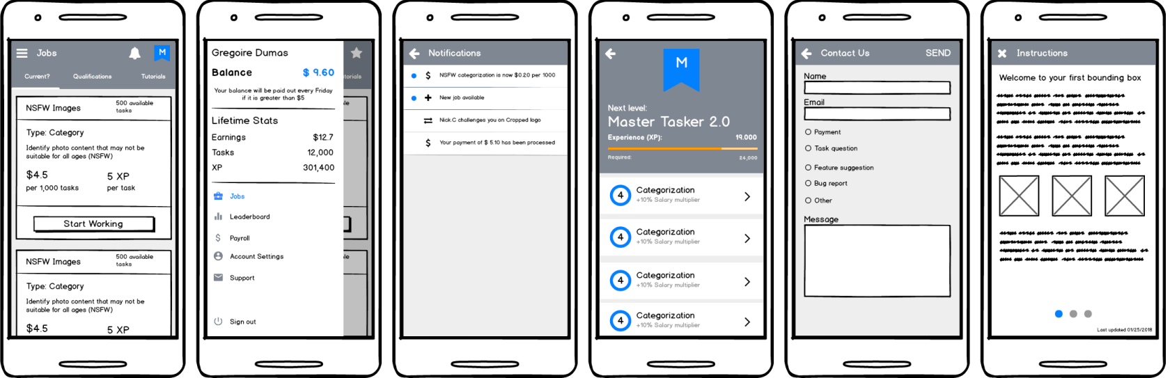
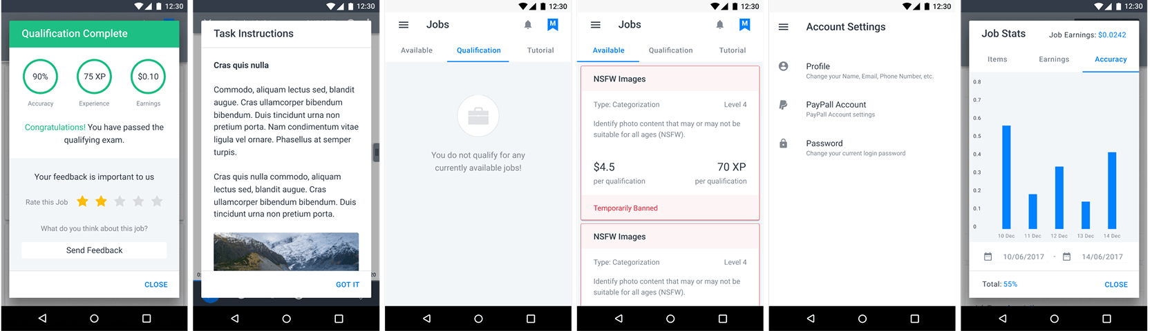
Early UI Development Phase
Limited Desktop Access Pattern:
Before addressing the complex task-interaction screens, the team focused on low-hanging UI elements generic surfaces that could be defined quickly to unblock engineering. These included:
- Modals and menus
- Instruction pages
- Notifications
- Scoreboards
- Home Dashboard (Job Cards)
Since Hive Micro already had an established design system and a functioning web version, we could immediately proceed to early design production.
1. Wireframes of Generic Screens
Using Balsamiq, we created lightweight wireframes of these shared screens to validate layout logic, hierarchy, and affordances. These were iterated rapidly with the internal Data Analytics and Dev teams to ensure feasibility and API alignment.
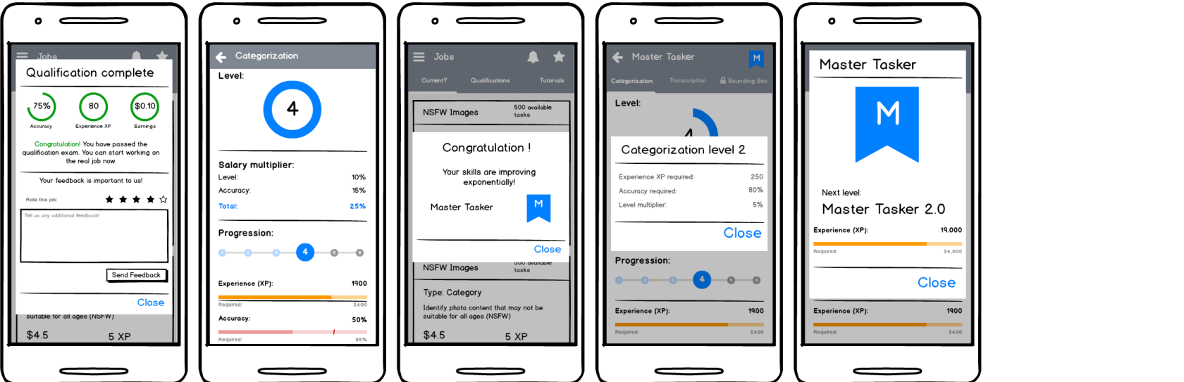
2. High-Fidelity Designs of Generic Screens
Leveraging the company's existing design system, high-fidelity UIs were produced immediately after wireframes. Visual hierarchy, spacing, and color treatments adhered to the established system, ensuring seamless integration once engineering was ready.
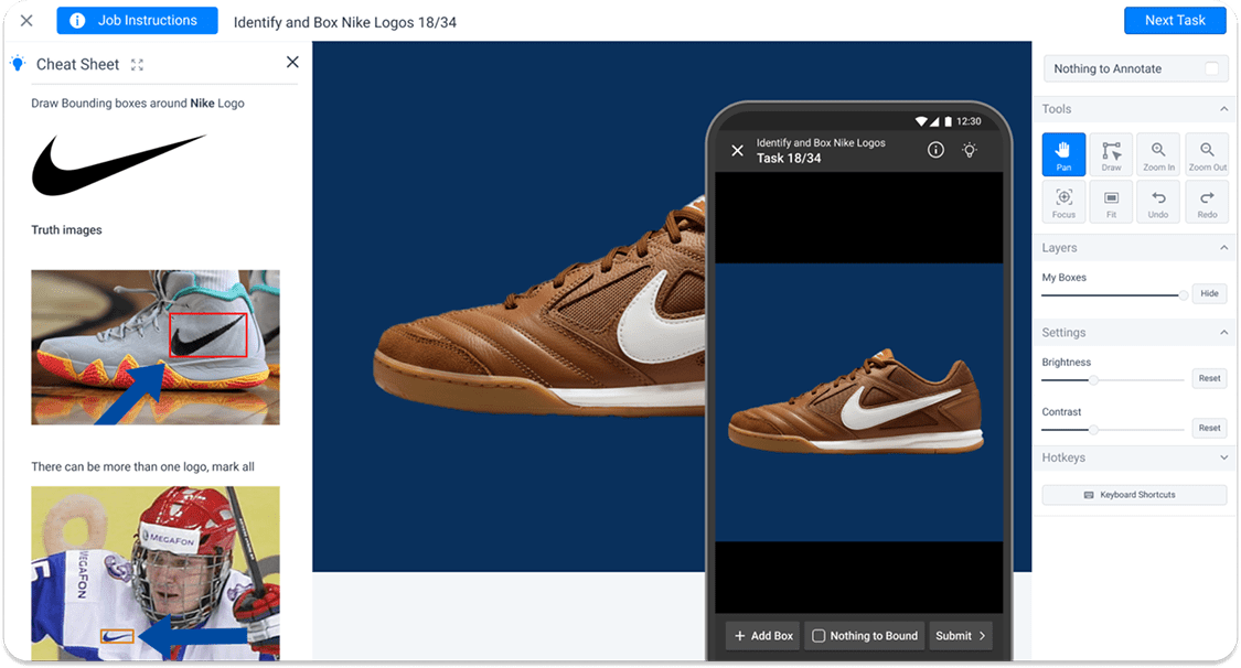
Complex Interaction Focus
While categorization tasks translated well to mobile, bounding-box tasks posed the real UX barrier. Workers needed to draw multiple rectangles accurately on small screens, pinch to zoom, and submit without error.
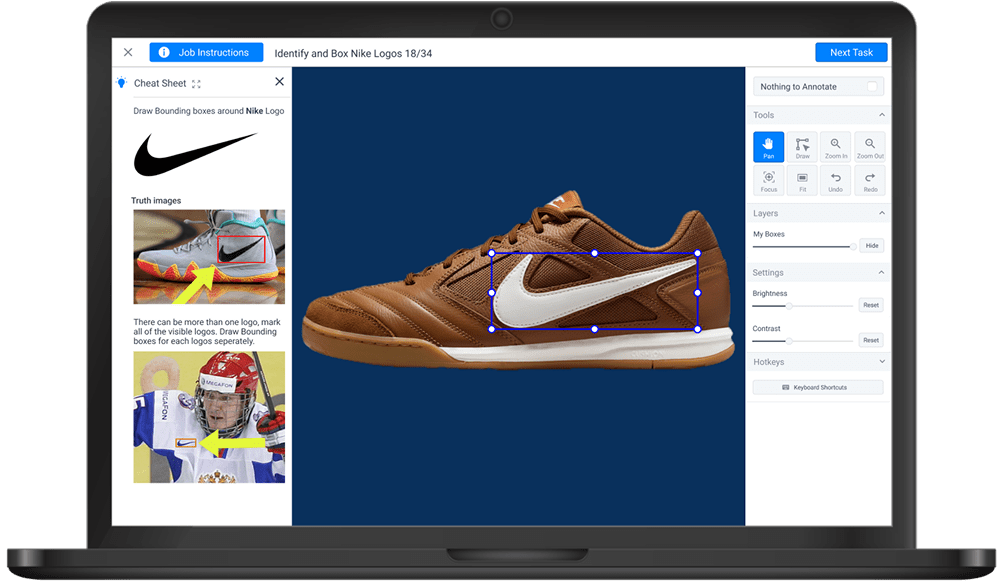
- Header Bar: "Job Instructions" button, task title, and a persistent Submit CTA that takes user to next task.
- Left Panel: Toggleable "Cheat Sheet" displaying example images and task-specific hints.
- Center: Main annotation canvas with task image draggable and resizable bounding boxes.
- Right Panel: Tool cluster containing Pan, Draw, Zoom In/Out, Focus, Fit, Undo/Redo actions; additional modules for Layers (opacity control) and Image Settings (brightness, contrast).
Iteration 1 - Establishing the Foundational Mobile Interaction Model
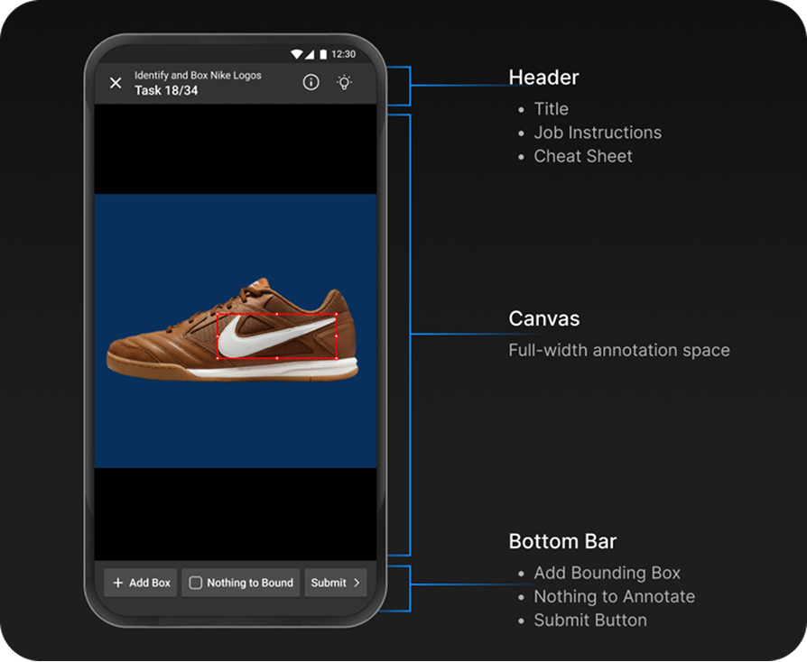
1. Rethinking UI Placement
We consolidated high-density desktop controls into a compact action bar:
- The page title
- Job instructions button
- Cheat Sheet toggle
All positioned in the header to free vertical space and keep the canvas as the primary focus.
- Right Panel: Tool cluster containing Pan, Draw, Zoom In/Out, Focus, Fit, Undo/Redo actions; additional modules for Layers (opacity control) and Image Settings (brightness, contrast).
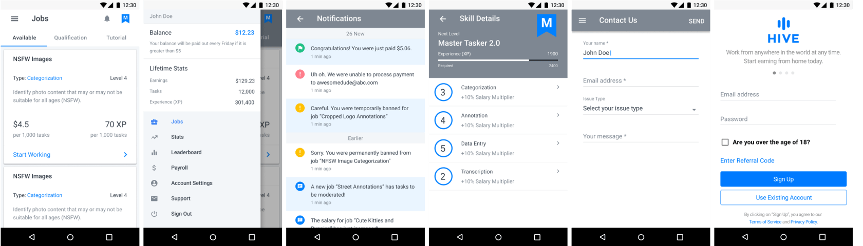
Final Design
- Vertical task hierarchy: Instructions → Image → Category
- Header with progress and language toggle
- Auto-fit zoom and gesture reset
- Overflow menu for rarely used settings
- Real-time feedback animations
- Semantic segmentation excluded on mobile due to precision limits
Reflection & Impact
Error rate
↓ 60 %
Completion speed
↑ 29 %
Retention
↑ 22 %
- Designing for constraint environments requires intentional clarity, not minimalism.
- Splitting deliverables enabled true design-development parallelism.
- Data-driven iteration bridged intuition and evidence.
- Mobile annotation must be selective in task types to protect worker experience.
Try the App
Experience the redesigned Hive Work mobile app firsthand. The app is available on both iOS and Android platforms, offering a streamlined interface optimized for mobile annotation tasks. You can also explore the web platform to see how the mobile-first approach differs from the desktop experience.
Download the app to see how the design improvements translate into real-world usability.
Conclusion
Hive Micro's mobile redesign demonstrates that a high-friction desktop workflow can be transformed into an intuitive, mobile-first experience through strategic prioritization and data-validated design.
By phasing delivery, leveraging an existing design system, and refining complex interactions through evidence, the team empowered workers across Latin America, Asia, and Africa to earn with confidence, one microtask at a time.